Touchpoint
Top 10 Website Navigation Tips for a Smooth User Experience
Website Navigation is important because it helps users to search for the content they wish to see. It is easy navigation through the website content, pages and information presented on the website. Keeping the website navigation structure simple is the key to ensuring that the user has a great experience while visiting your website.
Presented in a variety of ways like spider bars, menus in the footer or header etc, website navigation has an impact on traffic, conversion as well as bounce rates.
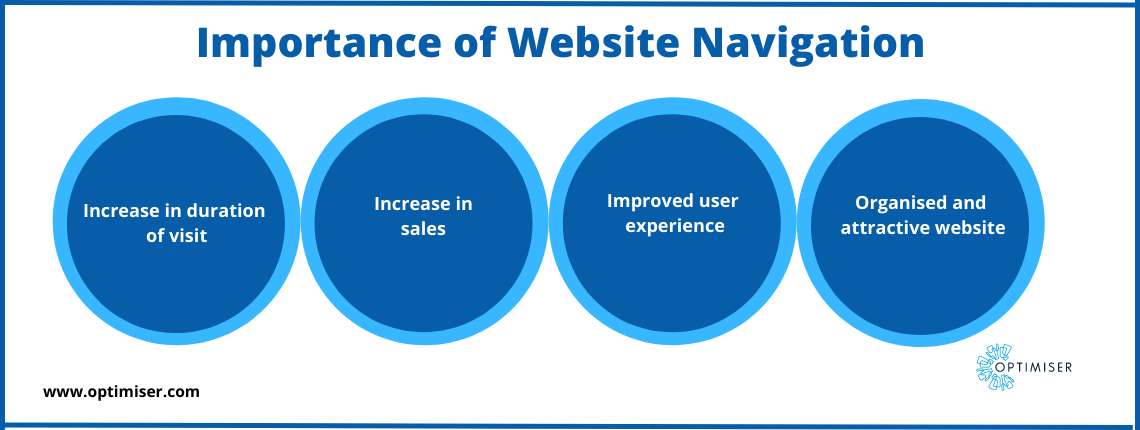
Website Navigation Importance
Duration of visit
Website Navigation helps people find information easily and swiftly. It encourages the visitors to explore more content on the website which in turn will increase the duration of their visit to your website. Easy navigation and a fast loading website can deliver the instant gratification that users seek out.
Sales
Website navigation holds a lot of promise when it comes to increasing sales. When there is no wastage of time while searching for information, you can expect that the consumer will develop an intent to purchase a product from you. Website navigation strengthens the impression of the users and in website building, the first impression is the last impression.
User experience
Without navigation, the website will not look good. At best, it will hold information the customer is looking for but is completely unorganised. It will impact the duration a visitor is on the webpage as well as its rankings. No one is going to spend their time figuring out how your website is organised. People want easy answers and simple navigation. Improving the user experience can do wonders for your business growth.
Design
Good navigation makes the website look attractive and organised. People can form a positive impression of the website upon their first visit and that can determine how long they will spend time on the website. For the success of the website, good navigation is a must. It does impact user experience, SEO rankings, traffic, sales, conversions, etc.

10 Website Navigation Tips for a Smooth User Experience
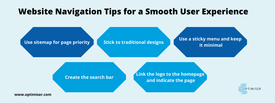
Use sitemap
When you are creating a website, develop a sitemap containing the content you wish to add. It will include all the items as well as the sub-categories of your user interface. This will help you prioritise which page is important for the visitors and focus on those.
Pages priority
You will need to prioritise the pages that the visitor will visit first. Depending on the kind of website you are creating, you can set your goals. Some guidelines to keep in mind while creating a website such as:
- What is the most valuable information that you offer to your visitors?
- How to direct your visitors through your funnel?
- What is the expectation you have for the website and how easily can the visitors navigate through it?
Conventions
Sticking to the traditions can be for the best when it comes to website building. Hyperlinks are blue, the logo is at the top corner of the website, and ample white space etc are familiar techniques.
Sticky Menu
A sticky menu is also known as a fixed or floating menu. This menu stays put even when the users scroll down the website. You do not want your users to scroll up every time to find another page.
Minimal Menu
Keep a maximum of six to seven categories in the menu so that users can process the information easily and reach the pages swiftly. If you have a lot of information to disseminate, then you can use a drop-down menu to add these subcategories.

Search Bar
A search bar is a great navigation trick for websites that have a lot of content. A customised search bar ensures that the user can quickly type in what they seek and find it seamlessly.
Using Optimiser Touchpoint, you can build a fully customised website for your business. The website builder is suitable for any type or size of business and does not need any prior coding knowledge. You can add whichever elements you desire and edit them as per your convenience.
Label the menu
Label the menu without any slang or jargon. It can be off-putting for visitors who are simply looking for information but do not understand the industry jargon, especially beginners. Make the menu text clear, descriptive and concise.
Perform A/B testing on your site to try out different versions and discover which design suits your business better.
Link logo to the homepage
Linking the logo to the homepage can create a shortcut that many users appreciate. After they are done scrolling through the website, they can easily travel back to the homepage rather than scrolling up to find the homepage option.
Also, instead of adding 'Homepage' to your menu, link the company logo to the homepage.
Indicate the page
When scrolling through the pages, users tend to get lost. Rather than letting them feel disoriented, you can add some breadcrumbs to the webpage and make it easily manoeuvrable. This means you can display the user's location on a page during their visit to the website. In the menu bar, use the (>) icon to display which page led the user to the current one.
Smooth navigation to any page
The rule of thumb while creating a website is that the user should be able to visit any page they desire without any trouble. Not every user will land on your homepage. They should be able to view every page on your website.
Summary
Website navigation plays a huge role in establishing your brand image in the market. It is the first step in interesting a potential customer into purchasing from you and hence, it deserves a lot more effort and attention to detail.

30 days free trial. No credit card required
 One powerful platform
 Simple to use
 Comprehensive


