Maximising The Impact Of Homepage Impact With 5 Design Strategies
A homepage is the main or introductory page of a website. It's the first page that visitors see when they enter the website's domain name into their browser or click on a link to the website. A homepage typically provides an overview of the website's content and directs visitors to other pages or sections of the site. It often includes a navigation menu, featured content, calls to action, and other elements that are designed to engage and guide visitors through the website. A well-designed homepage with the help of a website builder can provide a positive first impression, build trust, and encourage visitors to explore further.
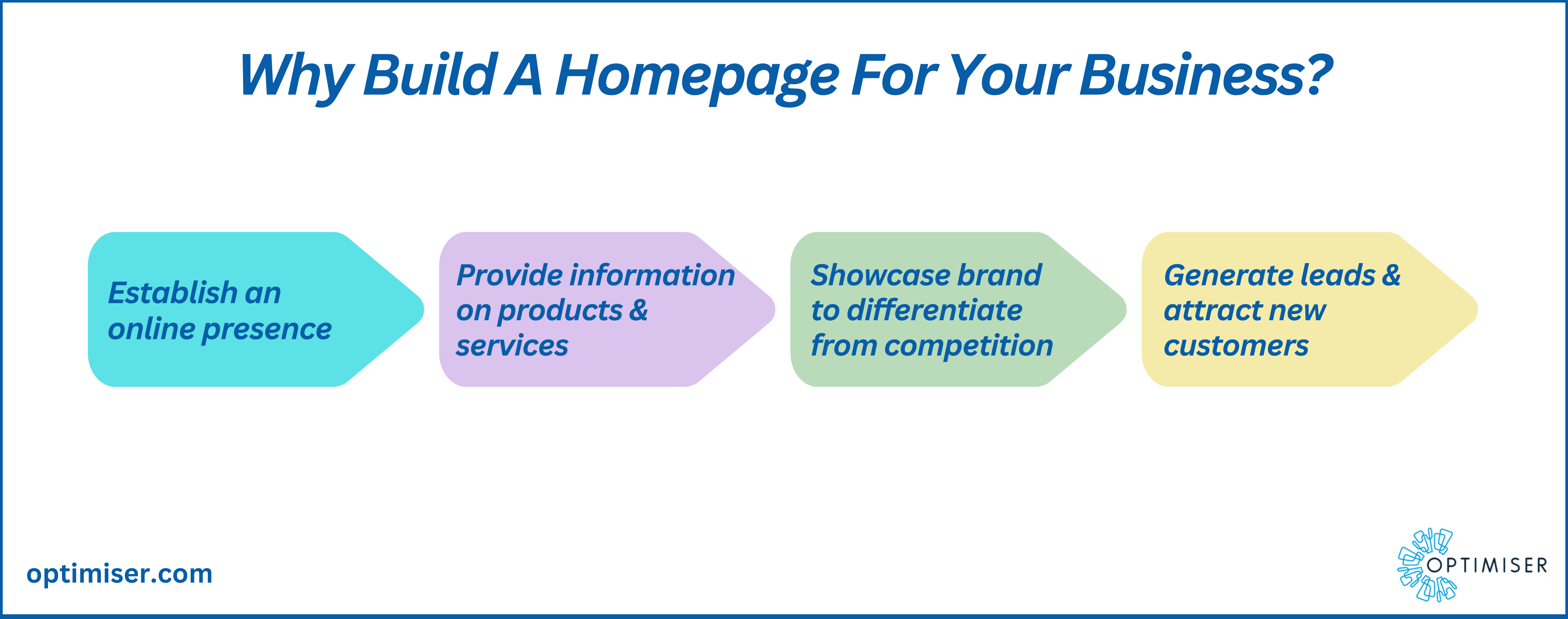
Why Should Every Business Have A Homepage?
- Provides credibility
A well-designed homepage provides credibility to the business. It shows that the business has a professional online presence and that one can take the business seriously. A homepage can also showcase expertise, experience, and customer testimonials, which can help to build trust with potential customers.
- Helps with branding
The homepage is an opportunity to showcase the brand's personality and values. It's a chance to use visuals, messaging, and design to differentiate itself from competitors and make a lasting impression on visitors. By having a consistent brand presence across the website, social media, and other online channels, businesses can strengthen their brand identity and recognition.

- Improves SEO
The homepage is often the first page that search engines index, making it an important factor in search engine optimisation (SEO). By optimising the homepage with relevant keywords, meta descriptions, and other SEO best practices, businesses can improve their search engine rankings with the help of a CRM Integrated Website Builder and drive more organic traffic to their website.
- Helps with navigation
A homepage serves as a hub for the website, providing easy navigation for visitors to find the information they need. By organising the homepage with clear navigation menus, featured content, and calls to action, businesses can guide visitors through their site and encourage visitors to take desired actions, such as making a purchase or filling out a contact form.
- Offers customer support
The homepage can also serve as a customer support channel, providing answers to frequently asked questions, contact information, and other resources. By offering helpful information and resources on the homepage, businesses can improve the customer experience and reduce the number of support requests.
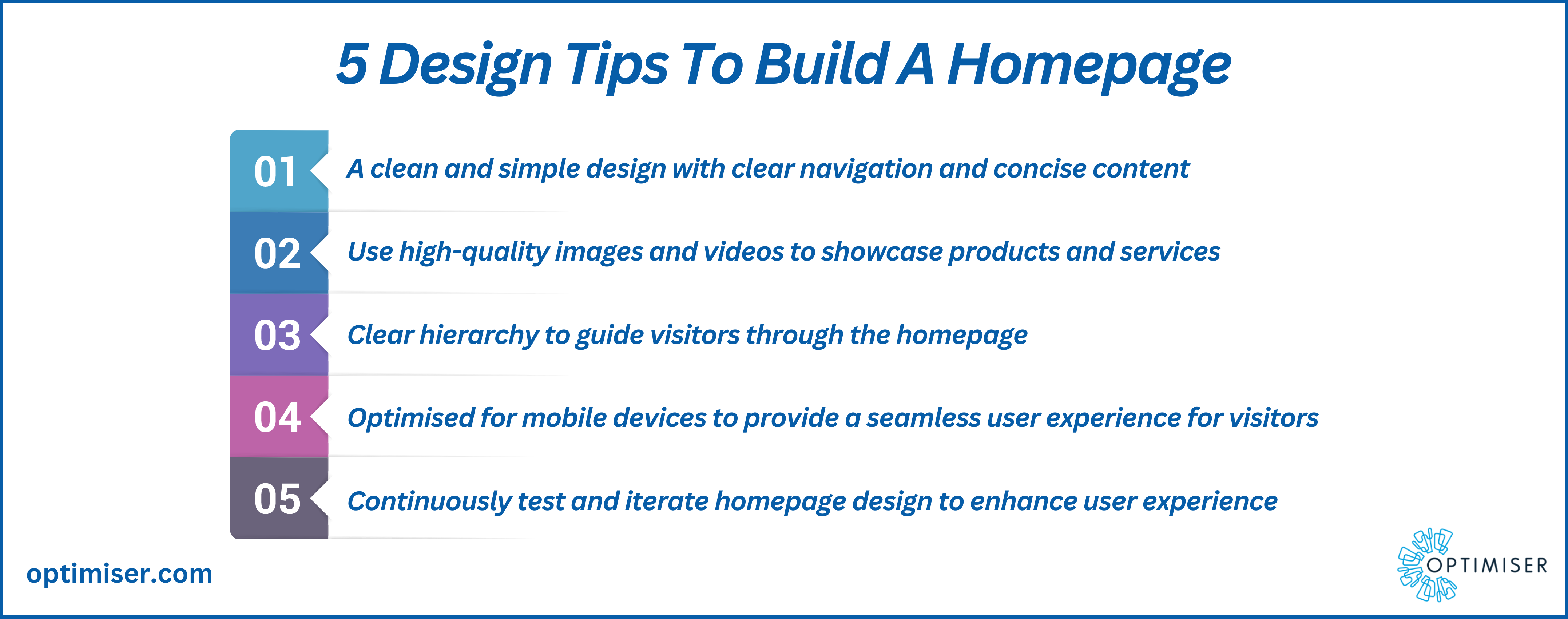
5 Design Strategies For A Stunning Homepage
- Keep it simple and uncluttered
One of the biggest mistakes that website owners make is trying to cram too much information onto their homepage. This can be overwhelming and confusing for visitors. To make a strong impact, the homepage should be simple and uncluttered. This means that businesses should prioritise the most important information and make it easy to find. Consider using a clean, minimalist design with plenty of white space to give the content room to breathe.
- Use high-quality images and visuals
Images and visuals are powerful tools for grabbing attention and conveying information quickly. Use high-quality images and visuals on the homepage to create a visual hierarchy and direct visitors to the most important parts of the site. Make sure that the images are relevant and aligned with the brand's style and tone. Be sure to optimise the images for web use, so they don't slow down the site's loading time.
- Hierarchy of information
The homepage should be organised in a clear and logical way that guides visitors to the most important information. Consider using a grid-based layout to create a visual hierarchy that highlights key information, such as the company's mission statement, value proposition, or featured products/services. Use bold typography, colour, and spacing to create a clear distinction between different sections of the homepage.

Also Read: Proven Customer Engagement Strategies For Businesses To Improve Customer Support
- Use CTA strategically
A call to action (CTA) is a button or link that encourages visitors to take a specific action, such as signing up for a newsletter, filling out a contact form, or making a purchase. CTAs are a critical component in converting visitors into customers, but they must be used strategically. Be sure to place CTAs in prominent locations on the homepage, such as above the fold or at the end of each section. Use strong, action-oriented language that clearly communicates the value proposition of the action you want visitors to take.
- Test and optimise for maximum impact
Designing a homepage that maximises impact requires a lot of trial and error. To ensure that the homepage is as effective as possible, businesses should test different elements, such as headlines, images, CTAs, and layout, and optimise based on the results. Use analytics tools to track visitor behaviour and make data-driven decisions about what's working and what's not. Test and optimise regularly to ensure that the homepage is always performing at its best.
Optimiser-Touchpoint Website Builder
Using the Optimiser-Touchpoint website builder to create a website now with a beautiful homepage is an excellent way to increase conversion rates. The platform is user-friendly and affordable and offers a wide range of design templates and customisation options that can help businesses create a visually appealing homepage.
One of the key benefits of using Touchpoint is that businesses do not need to have any coding or design experience to create a professional-looking homepage. The platform offers drag-and-drop interfaces that make it easy to add and arrange content elements such as images, text, and videos. Businesses can test and optimise for maximum impact. They can create a homepage that engages visitors, builds trust, and ultimately drives conversions.
Summary
Having a homepage for business is essential in today's digital landscape. It provides credibility, helps with branding, improves SEO, helps with navigation, and offers customer support. By investing time and resources into creating a high-quality homepage, businesses can attract more visitors, build trust with potential customers, and ultimately grow their business.

30 days free trial. No credit card required
 One powerful platform
 Simple to use
 Comprehensive


