
Mobile Navigation 101: What Are The Essentials?
Mobile navigation with website builders is used for navigating or moving through a mobile application or website using a mobile device such as a smartphone or tablet. It involves the use of touchscreens, icons, menus, and other user interface elements to help users move around within the application or website.
Popular Types Of Mobile Navigation
Mobile websites have become increasingly popular as people use their smartphones and tablets more frequently for browsing and accessing online content. To ensure a seamless user experience, mobile websites often use different types of navigation to help users move around within the website. In this article, we will discuss some common types of mobile website navigation, including tab bar, grid-based, hamburger, and drawer navigation.
Tab bar navigation: Tab bar navigation is a popular type of mobile website navigation that displays a row of tabs at the bottom of the screen. Users can tap on the tabs to switch between different sections or pages of the website. This type of navigation is often used for websites with a limited number of sections or pages, as it can become crowded and difficult to navigate if there are too many tabs.
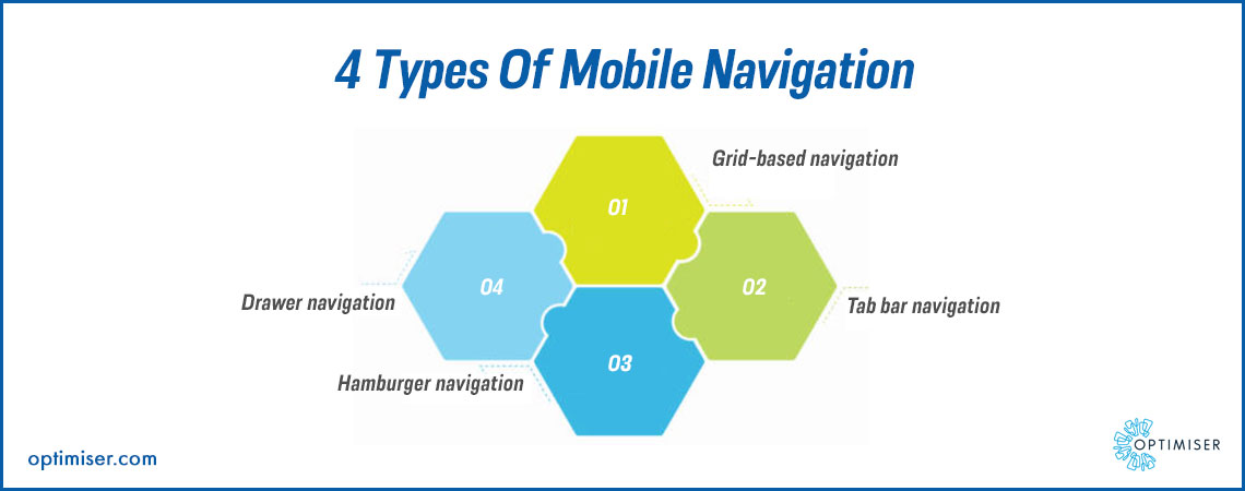
Grid-based navigation: Grid-based navigation is a type of mobile website navigation that displays a grid of icons or images representing different sections or pages of the website. Users can tap on the icons or images to access the corresponding section or page. Grid-based navigation is often used for websites with a large number of sections or pages, as it allows users to easily find and access the content they are looking for.
Hamburger navigation: Hamburger navigation that is built with help of an easy to use website builder is a type of mobile website navigation that displays a hamburger icon (three horizontal lines) in the top left or right corner of the screen. When users tap on the hamburger icon, a menu slides out from the side of the screen, displaying different sections or pages of the website. This type of navigation is popular for mobile websites with a lot of sections or pages, as it allows users to easily access the menu without taking up too much space on the screen.
Drawer navigation: Drawer navigation is a type of mobile website navigation that is similar to hamburger navigation but displays a menu that slides out from the bottom of the screen instead of the side. Drawer navigation is often used for websites that require a lot of user interaction, such as e-commerce websites, as it allows users to easily access different sections or pages without interrupting their browsing experience.
When choosing a navigation type for a mobile website, there are several factors to consider, including the number of sections or pages on the website, the amount of user interaction required, and the user's familiarity with different types of navigation. It is also important to ensure that the navigation is intuitive, efficient, and user-friendly, allowing users to move around within the website easily and without confusion.
Essentials For Mobile Navigation
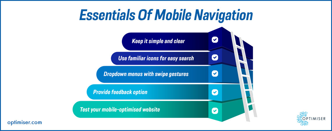
Design for touchscreens: Mobile devices are primarily operated using touchscreens, so it is essential to design your website's navigation with touchscreens in mind. Buttons and links should be large enough to accommodate the user's finger, and there should be enough space between buttons to prevent accidental taps.
Keep it simple: Mobile screens are smaller than desktop screens, so it is essential to keep your website's navigation simple and straightforward. Focus on the most important sections and pages of your website and prioritise them in your navigation.
Also Read: Web Design Trends To Know In 2023
Use clear labels: The labels you use for your website's navigation should be clear and concise, indicating what the user can expect to find when they tap on a link or button. Avoid using obscure or vague labels that can confuse users.
Icons: Icons can be a useful addition to your website's navigation, especially on mobile devices where screen space is limited. Icons can quickly convey the purpose of a button or link, making it easier for users to understand the purpose of each navigation element.
Mobile-first design: By designing for mobile devices first, you can ensure that your website's navigation is optimised for smaller screens, touchscreens, and slower internet speeds.
Test navigation: Once you have designed your website's navigation, it is essential to test it thoroughly on a variety of mobile devices and screen sizes. This will allow you to identify any issues or challenges that users may encounter and make the necessary adjustments to improve the user experience.
Search functionality: Search functionality can be a useful addition to your website's navigation, especially for users who know what they are looking for but are unsure of where to find it. Search functionality should be easy to access and prominently displayed within your website's navigation.
Optimiser-Touchpoint Website Builder
Optimiser-Touchpoint Website builder with CRM offers features for creating mobile-optimised websites. It provides a user-friendly interface that allows users to create mobile-friendly websites without any coding skills. This platform is ideal for small businesses and individuals looking to create a professional and functional mobile website quickly. The platform also includes a range of tools to help optimise your website for search engines, including meta tags and mobile sitemaps.
Summary
Mobile website navigation is a crucial aspect of mobile user experience. It is a critical aspect of mobile web design that can make or break the user experience. With mobile devices accounting for the majority of web traffic, it is more important than ever to ensure that your website's navigation is optimised for mobile devices.

30 days free trial. No credit card required
 One powerful platform
Simple to use
Comprehensive
One powerful platform
Simple to use
Comprehensive